Work / Sheet 06 of 11
EcoSphere
A brand identity and a 15-page guideline book for EcoSphere, a sustainable home-products brand.
- Project
- Brand identity & guidelines
- Year
- 2024
- Contents
- Logo · Clear space · Backgrounds · Typeface · Colour · Process
- Type
- Neometric (logo) · Poppins (corporate)

The brand
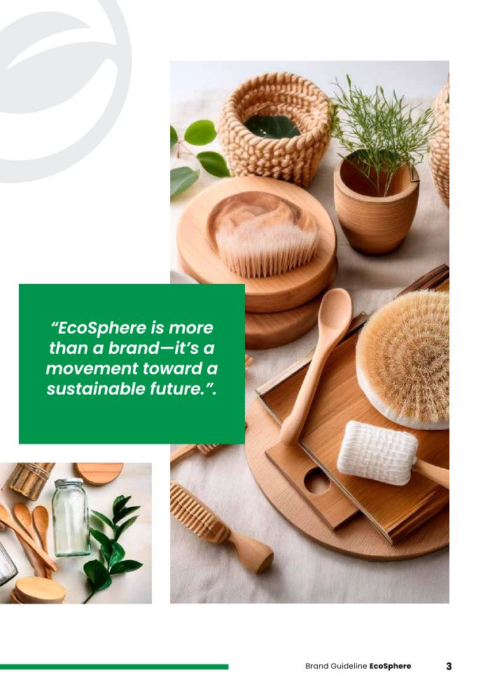
The guideline describes EcoSphere as a brand “dedicated to making eco-friendly living accessible to all”, with a mission to help people make greener choices at home.
“EcoSphere is more than a brand — it’s a movement toward a sustainable future.”EcoSphere brand guideline, p.3
The mark
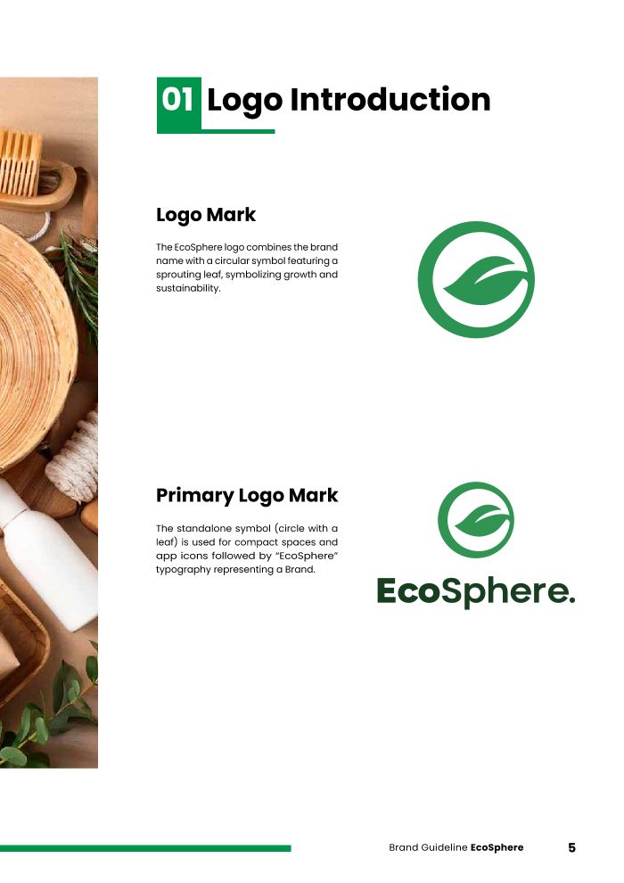
A sprouting leaf sits inside a circle: the sphere and the growth in one symbol.
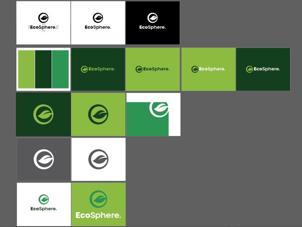
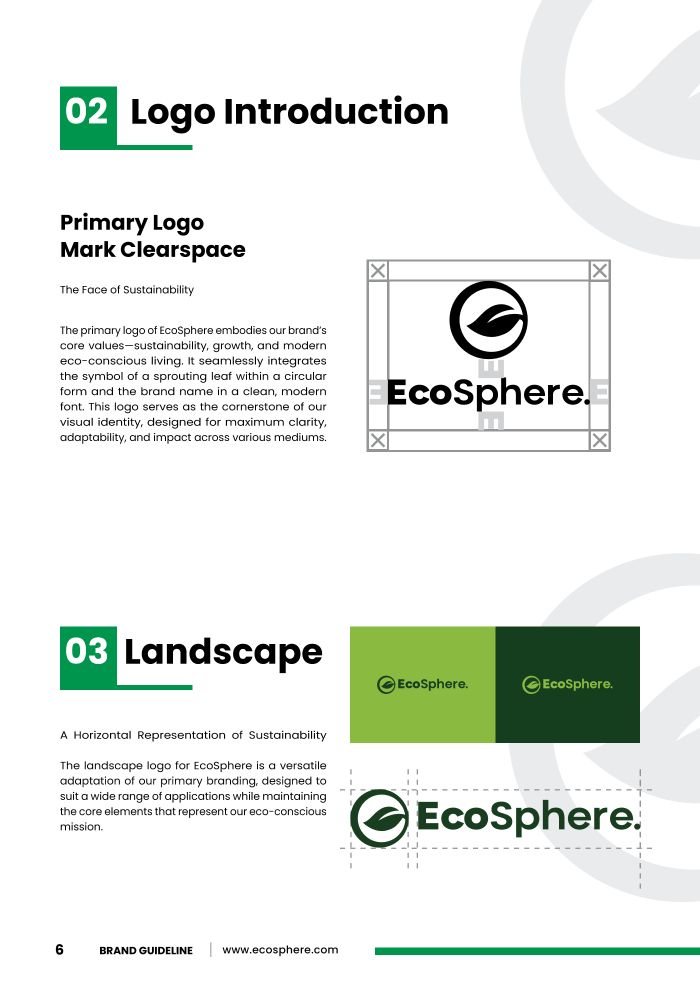
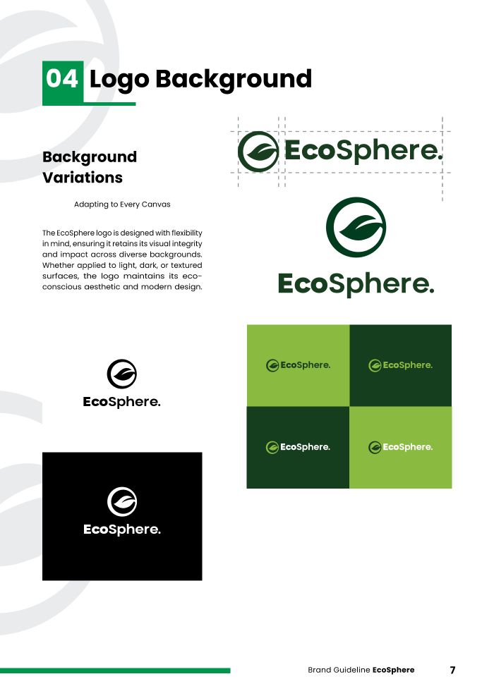
The standalone symbol covers compact spaces and app icons, and a landscape version handles wide formats. The logo board tests it on white, black and two greens, and as an oversized, cropped symbol for backgrounds.

The book
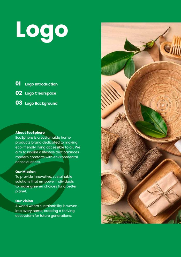
Each section opens on a full-green divider and then works through the rules page by page.
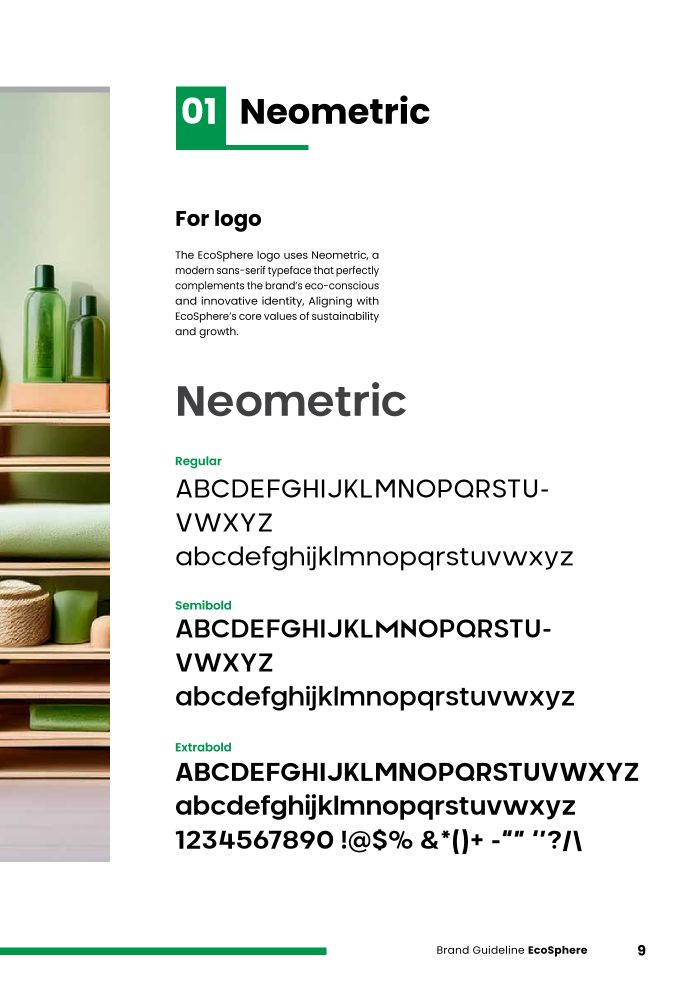
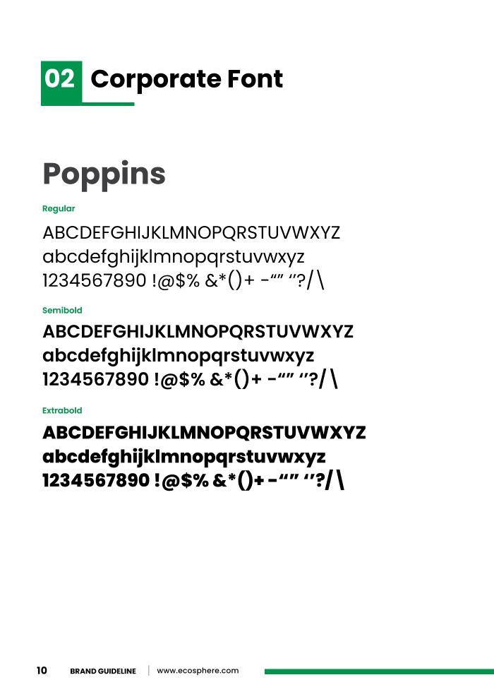
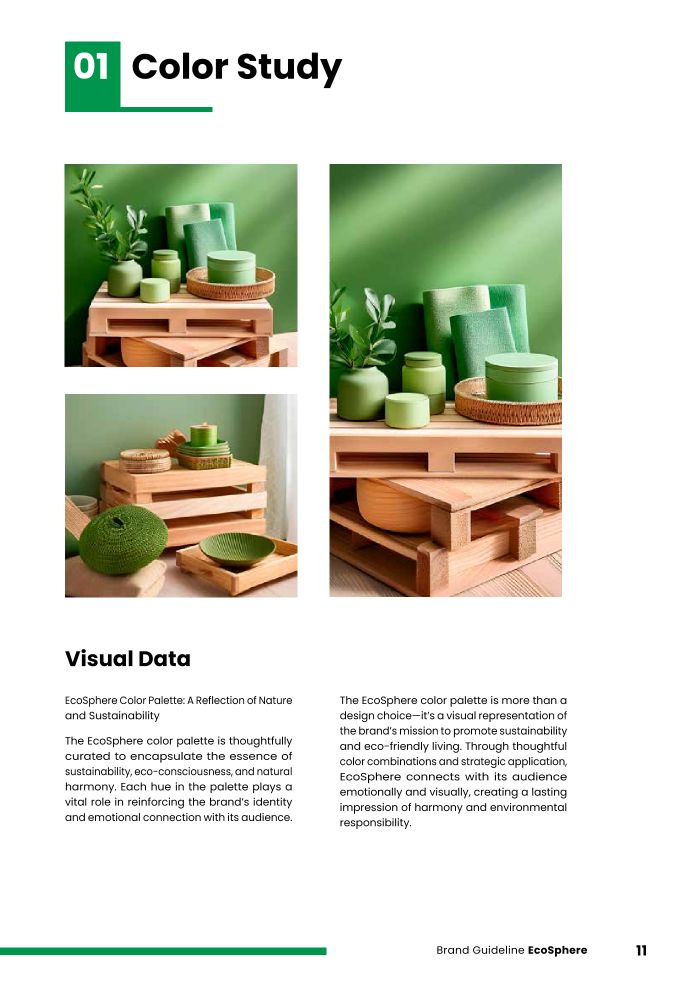
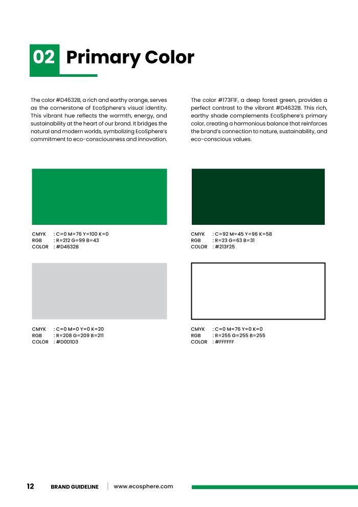
Neometric sets the logo. The book chooses it for its geometric construction, legibility in print and on screen, and balanced, minimal letterforms. Poppins is the corporate face. The palette pairs a vivid leaf green with a deep forest green and a light grey.
Process, on the record
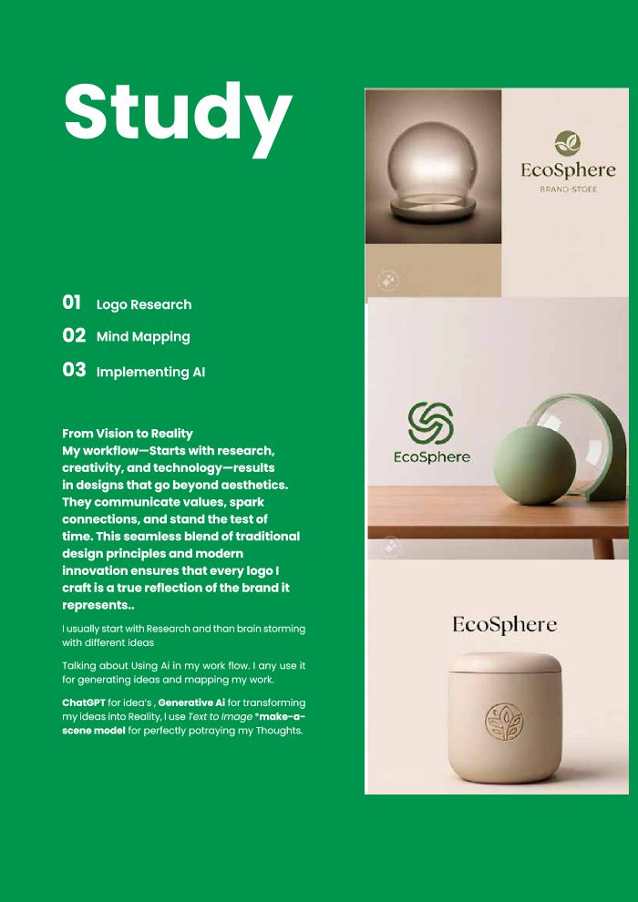
The final pages document how the identity was made: logo research, then mind mapping, then AI.
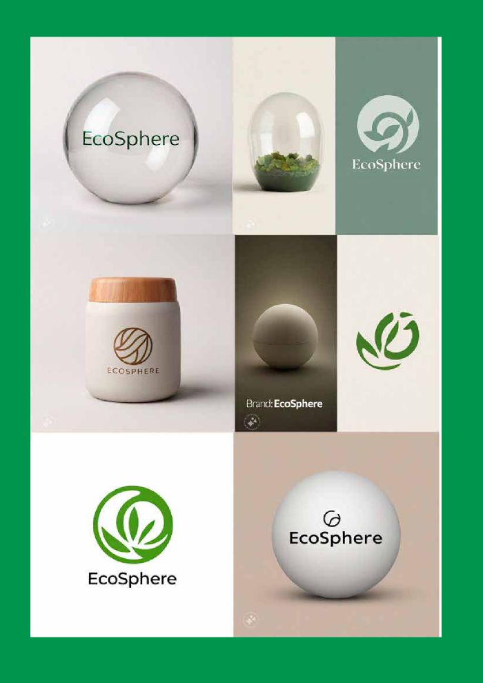
The book is open about where AI fits in. ChatGPT was used to generate ideas, and a text-to-image model to turn them into pictures. The last spread collects those explorations of the mark on jars, glass and paper.