.338 Saber
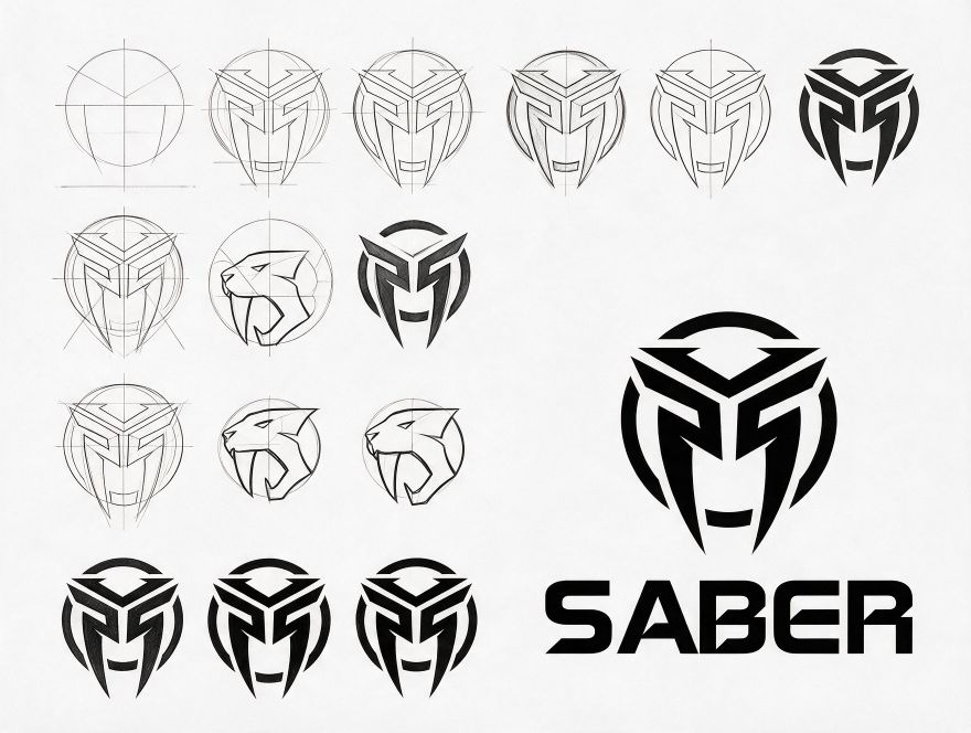
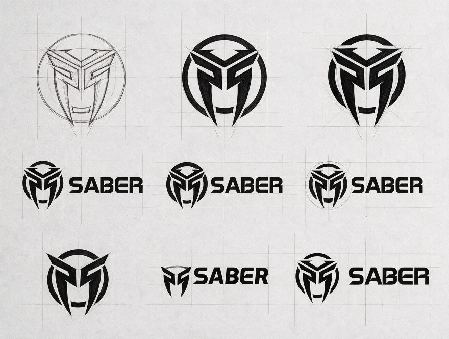
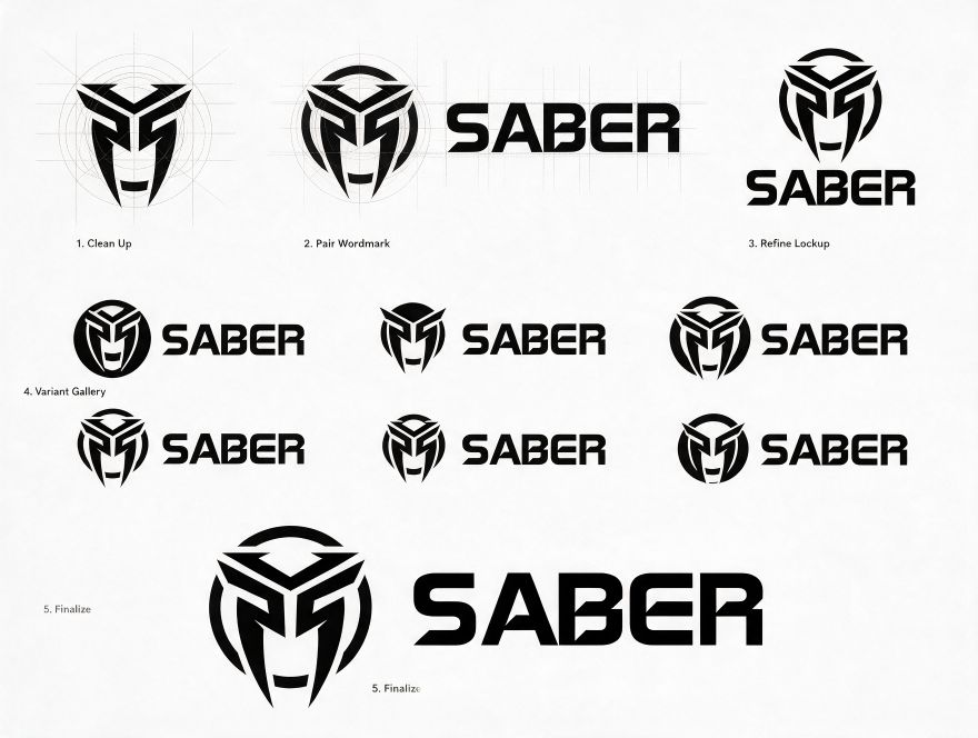
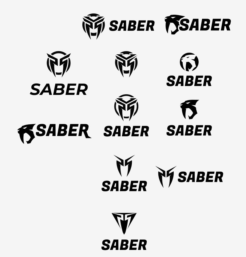
Sniper rifle. A helmet-like mask built from an S, mirrored and set inside a broken ring, with a squared, cut-in wordmark. A sabre-tooth cat was explored and dropped for something more abstract.



Work / Defence portfolio / Current role, 2025 —
I lead visual communication for SSS Defence, an Indian small-arms, ammunition and counter-drone manufacturer. The brand has to work in front of armed forces, police and government buyers, so every piece is precise, restrained and signed off by engineering before it goes out.
I’m the design function at SSS Defence. I own the brand end to end, from the guidelines to the expo floor, and work directly with management and the engineers who build the products.
Day to day that means catalogues, datasheets and tender decks for armed forces, police and government buyers; launch campaigns and the company’s social channels; product photography and video; 3D models and exploded views of firearms; and the stall, graphics and print for every defence show the company attends.
Defence brings its own discipline. Nothing is published until engineering and management have signed it off, and every image is checked for what it gives away. I design with that review built in, so releases move quickly without leaking anything they shouldn’t.
What I bring to a defence brand, and where you can see it on this sheet.
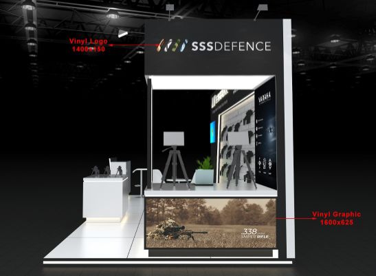
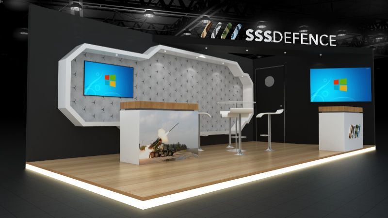
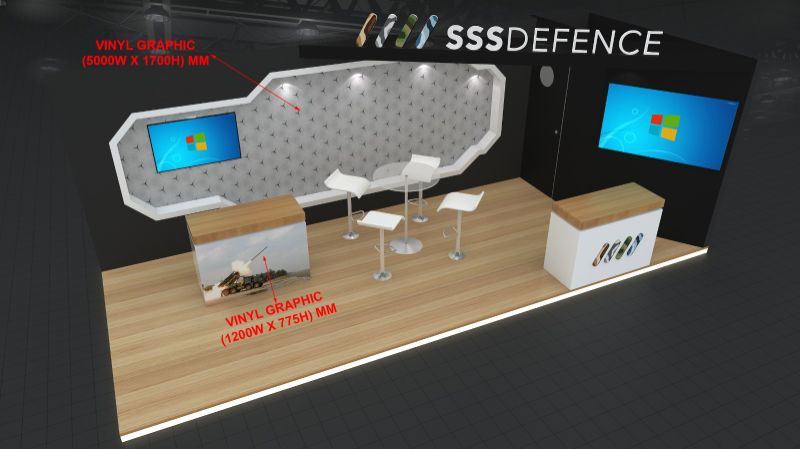
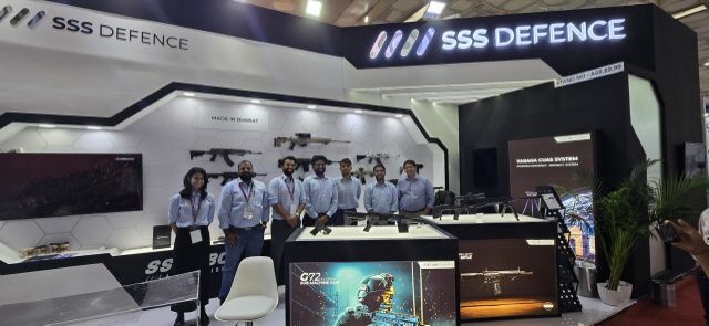
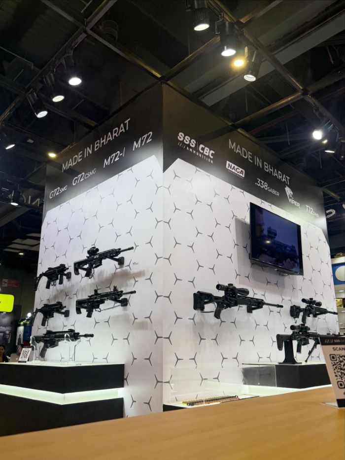
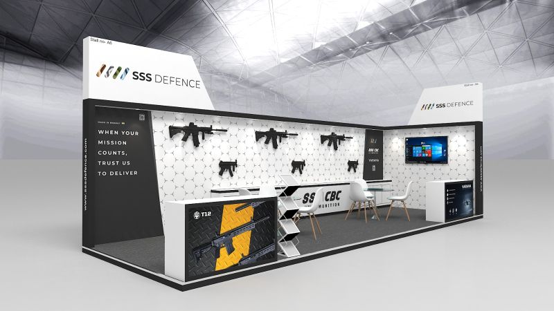
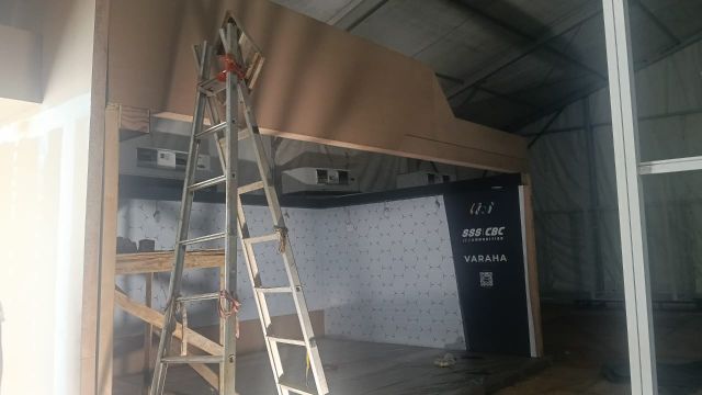
Stall concepts, 3D renders, fabrication specs and every graphic on the booth, from the fascia to the counter wraps, followed through to the finished build.
Shown in Exhibitions
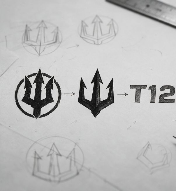
Marks for individual weapon platforms that sit under the SSS Defence brand: drawn on a grid, tested as stencils and single-ink badges.
Shown in Saber & T12
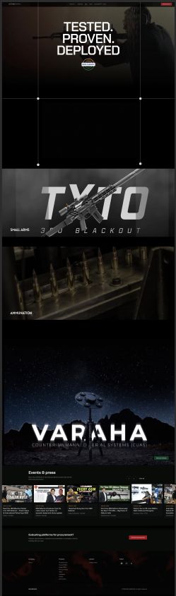
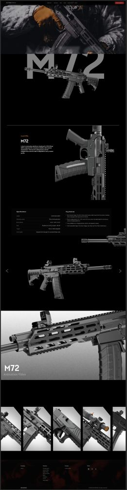
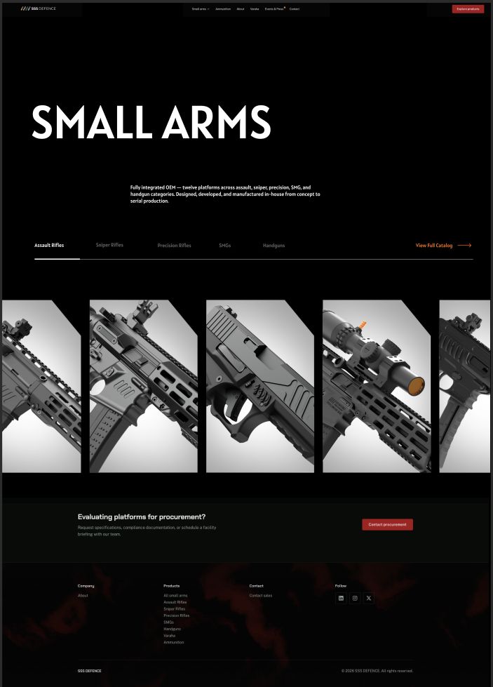
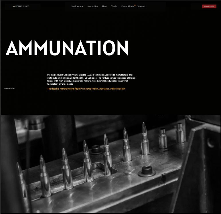
The company website and its product pages, designed dark and image-led, and built with Claude Code and AI tooling.
Shown in Website
Catalogues, datasheets and tender decks that make engineering specifications readable to procurement panels.
Withheld
Firearm modelling, renders and exploded views; product photography, trials footage and launch films.
Shown in 3D renders · film withheld
Reviewing every release for sensitive detail, and running sign-off with engineering and management before anything goes public.
Applied throughout
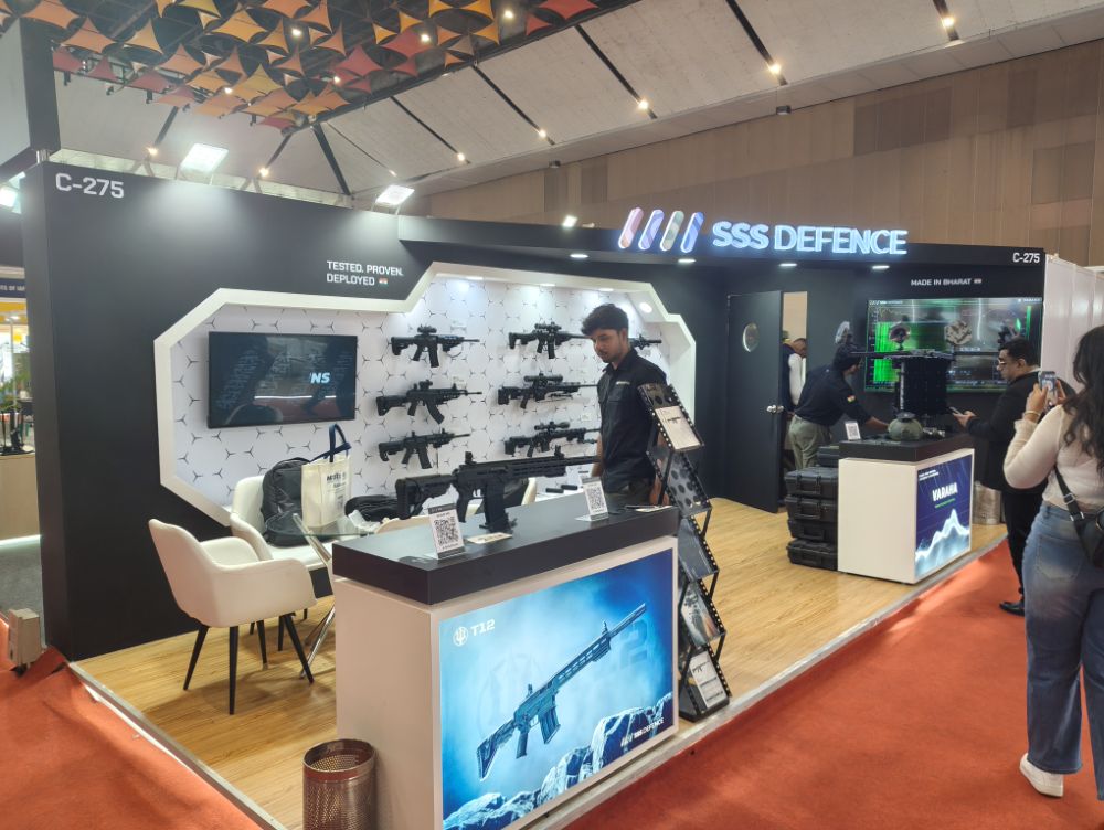
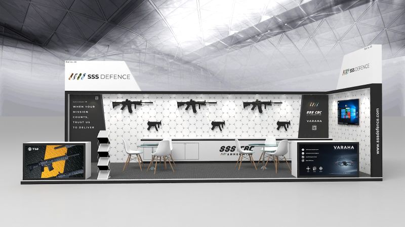
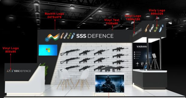
One stall language, rebuilt for every floor plan: a black shell, a white hexagon wall that turns the rifles into the display, and lit product counters for each platform.
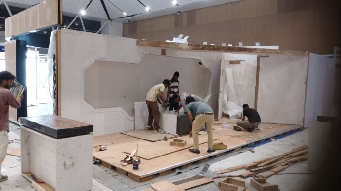
For each show I take the stall from concept render to fabrication. The renders go to the fabricator with every graphic dimensioned, and I follow the stall through the build so print, lighting and placement match the render when the doors open.
Individual platforms get their own marks, drawn to sit beside the SSS Defence logo on a rifle, a counter wrap or a datasheet.
Both start the way all my identities do: pencil construction on a grid, a wide set of variants, then a stress test as a stencil, a single-ink badge and a stacked lockup.
Sniper rifle. A helmet-like mask built from an S, mirrored and set inside a broken ring, with a squared, cut-in wordmark. A sabre-tooth cat was explored and dropped for something more abstract.
A trident drawn in pencil and reduced step by step, paired with a stencil-cut T12. The finished badge has a distressed edge so it reads as painted onto kit rather than printed.





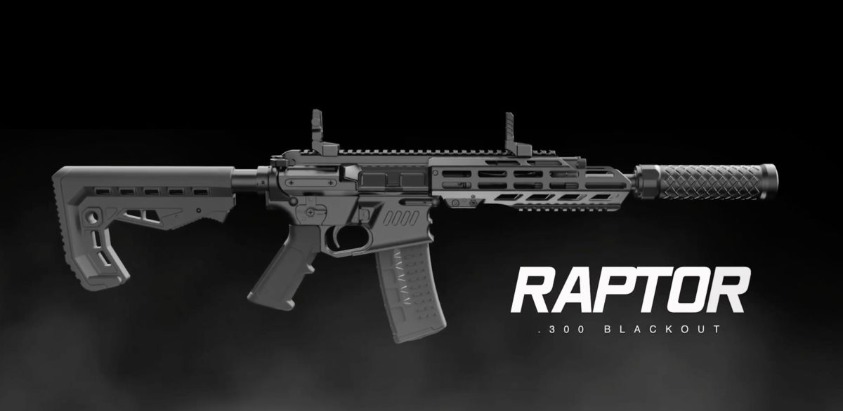
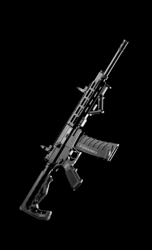
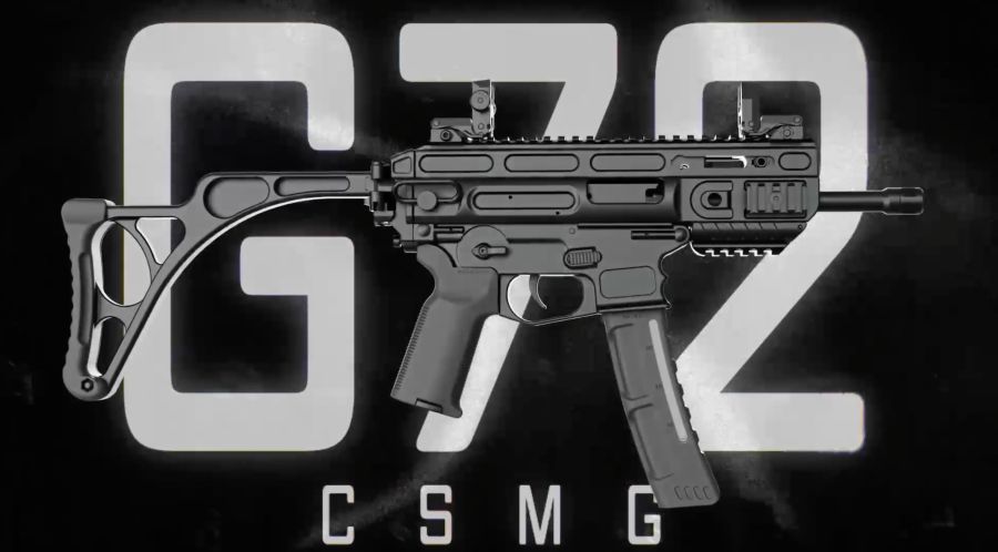
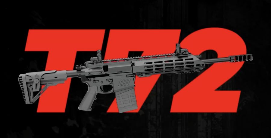
I model, light and render the weapons myself, then build the key visual around each one.
The look is consistent across the range: low-key studio light that picks out the machining, smoke and grain in the background, and an oversized model name set behind the weapon. The same renders feed the website, the expo counters, social launches and the catalogues.
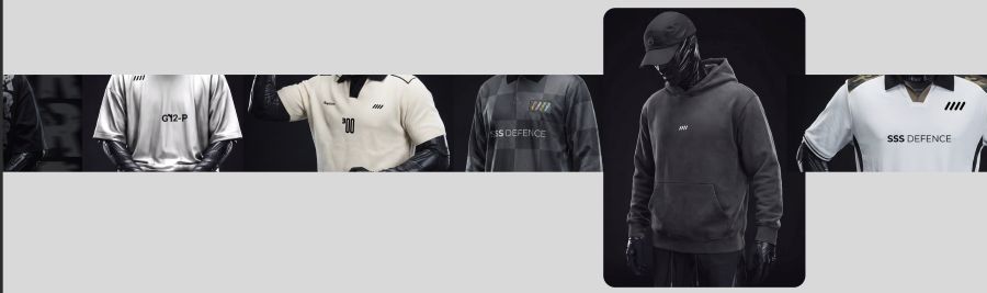
The company website: black, cinematic and product-first, with the line “Tested. Proven. Deployed.” over the opening frame.
Each part of the business gets a full-bleed chapter: small arms, ammunition and the Varaha counter-drone system. Product pages pair a large type treatment with renders, specifications and an animation reel, and every page ends on a route to procurement. I designed it and built it with Claude Code.