Work / Sheet 03 of 11
Elite Wave Media
The agency’s own identity, designed alongside the pitch decks it used to move into corporate accounts.
- Client
- Elite Wave Media LLP (in-house)
- Discipline
- Logo · Brand guidelines · Pitch decks
- Year
- 2024
- Role
- Logo and brand assets; research on target companies; pitch decks
- Tools
- Illustrator · PowerPoint
Context
Alongside client work, I designed the agency’s own brand. Then I researched the corporate companies it wanted to win and built the pitch decks that presented its capabilities to them.
The mark
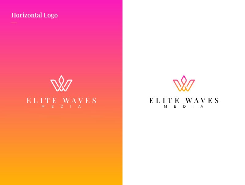
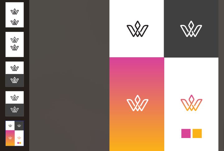
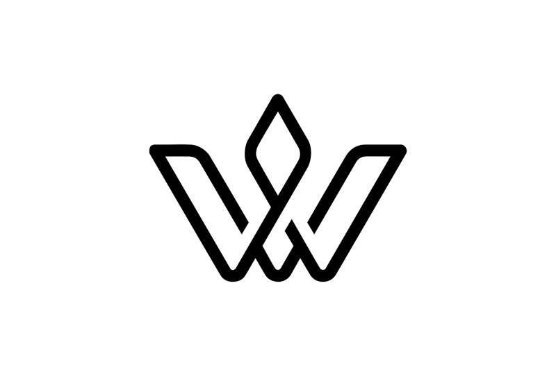
The W is drawn as a single monoline: two V strokes that interlock and rise to a diamond at the centre.
It pairs with a high-contrast serif wordmark and widely tracked MEDIA beneath. Construction boards test the symbol at weight and on light and dark grounds before it goes into the system.
The guidelines
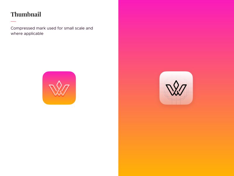
The guidelines define the full, horizontal and reversed logos, a single-colour version and a rounded app-icon thumbnail.
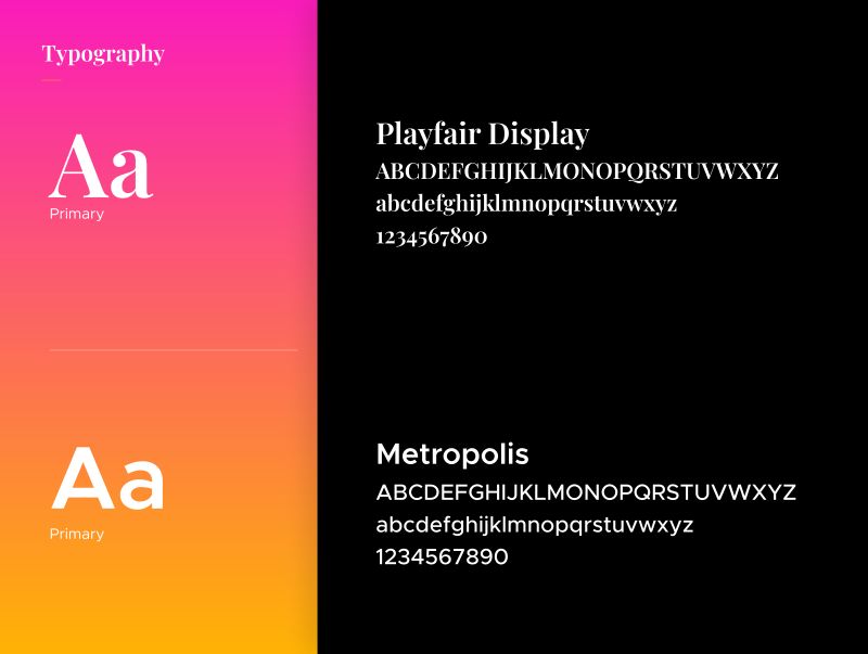
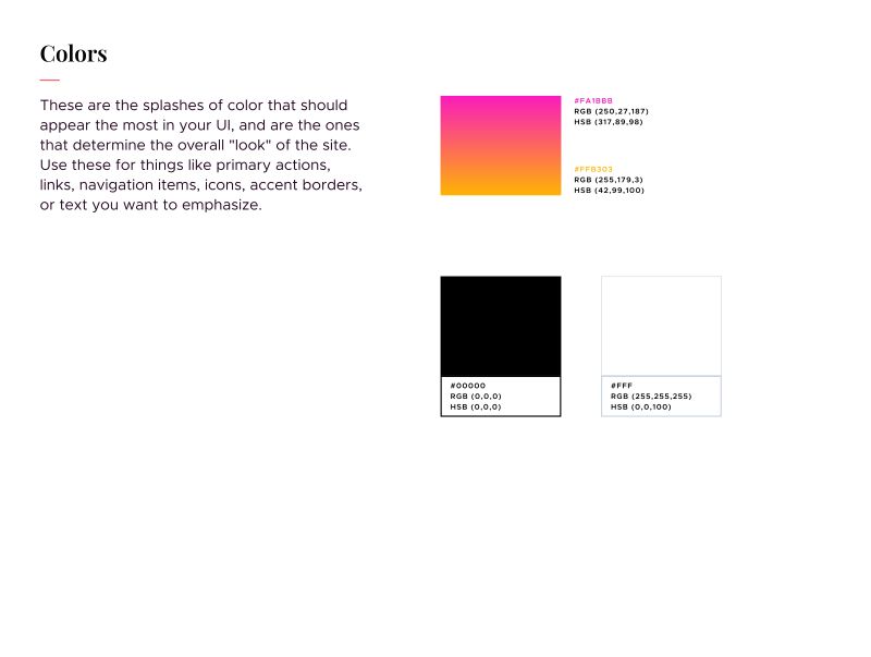
The single-colour logo exists for jobs where only one ink is available. Typography pairs Playfair Display for headlines with Metropolis for text. Colour runs from magenta to orange, held against black and white.