Work / Sheet 11 of 11
Identity studies
Four smaller identities, each taken from the logo to the places it would have to live.
- Contents
- Camel Clothing · Global Services · Tynex · Sobo25
- Discipline
- Logo design · Brand application · Mockups
A · Camel Clothing
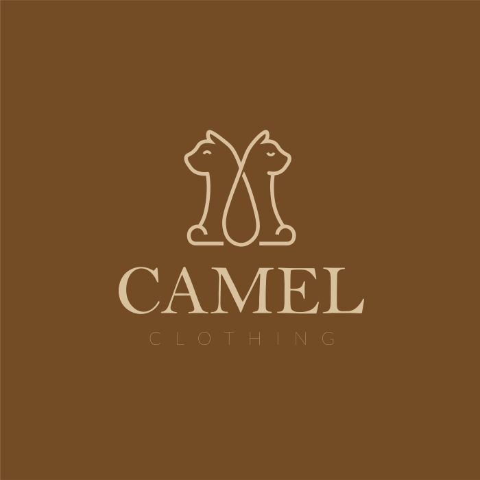
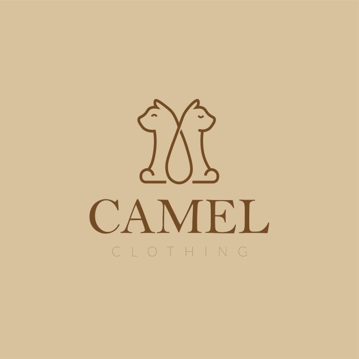
A line-drawn emblem of two mirrored animal figures above a high-contrast serif wordmark, with CLOTHING tracked wide beneath. Brown and sand carry it from storefront glass to stickers.
B · Global Services
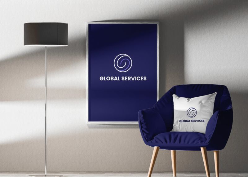
A spiral set inside a circle, in white and lavender on deep navy, with a rounded bold wordmark. The mockups test it at building scale and at arm’s length.


C · Tynex
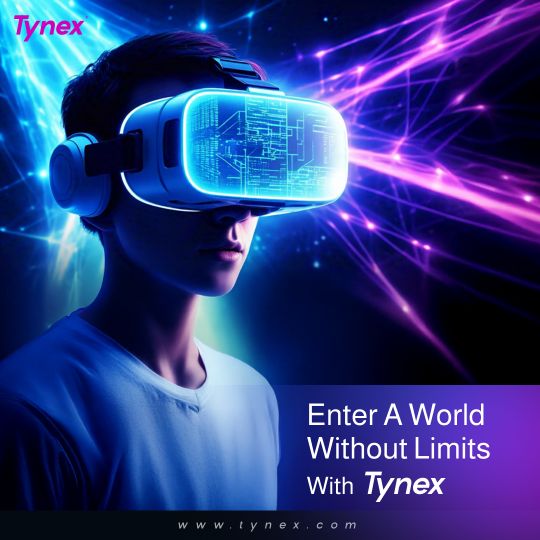
An identity for an AR/VR brand under the line “Bridging worlds seamlessly”. The wordmark is a heavy italic sans in black, white and magenta, with a rounded badge version. The brand board names neural pathways and energy flows as its core visual ideas, and the launch posts follow them in violet and blue light.


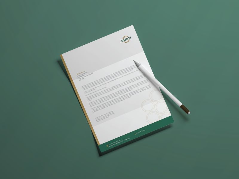
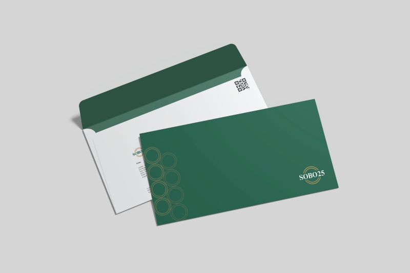
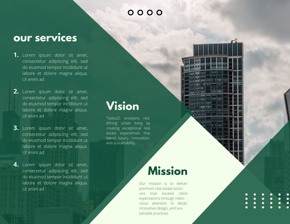
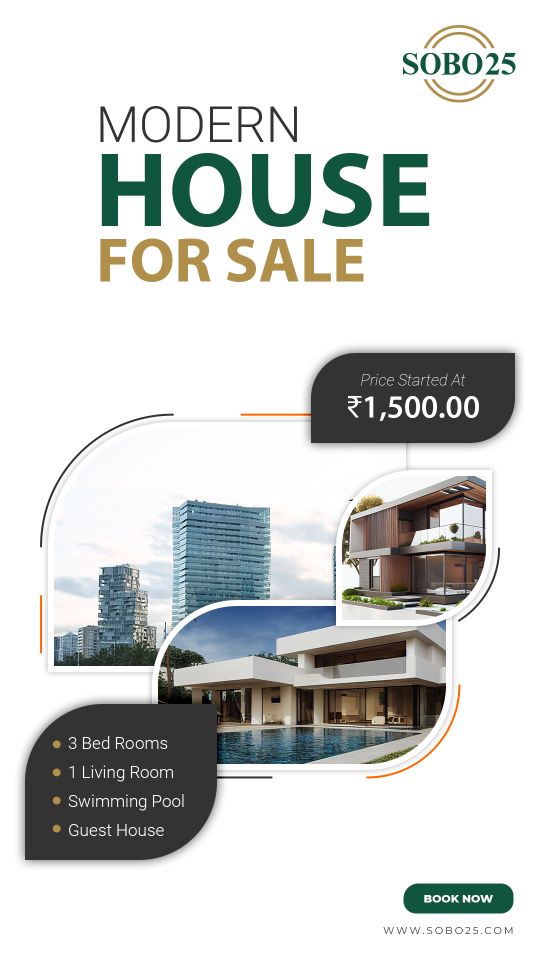
D · Sobo25
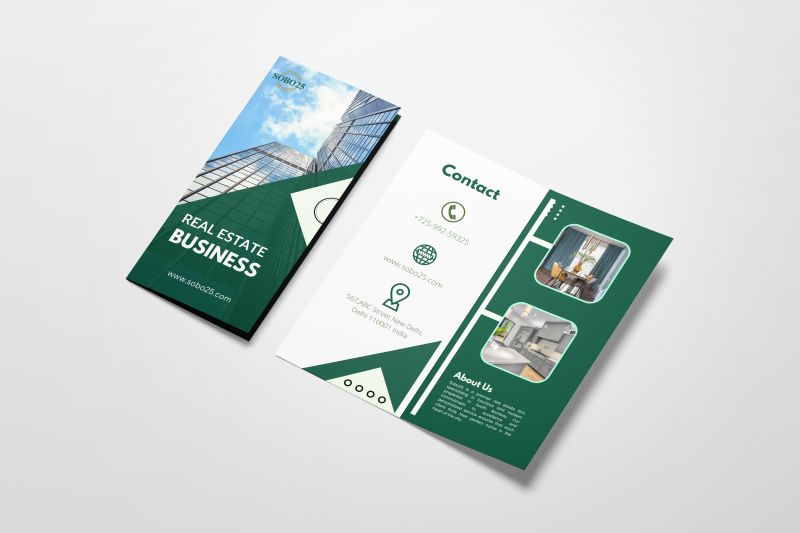
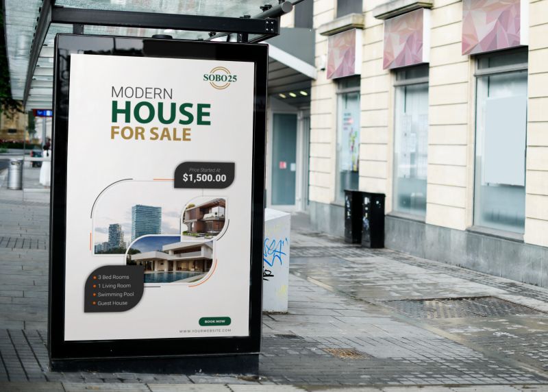
A real-estate identity in deep green and gold. A circular wordmark carries across letterhead and envelopes, a tri-fold brochure, a “Modern house for sale” poster and a bus-shelter placement.