Work / Sheet 01 of 11
Trikona Studio
A complete rebrand for a Bengaluru media and photography studio, taken from sketchbook to storefront and simplified a year later.
- Client
- Trikona Studio, Bengaluru
- Discipline
- Logo · Brand identity · Print & large format · Digital
- Year
- 2023 — 2024
- Role
- Logo from sketches and moodboards to final identity; rollout across digital, banners and hoardings
- Tools
- Illustrator · Photoshop · CorelDRAW
Context
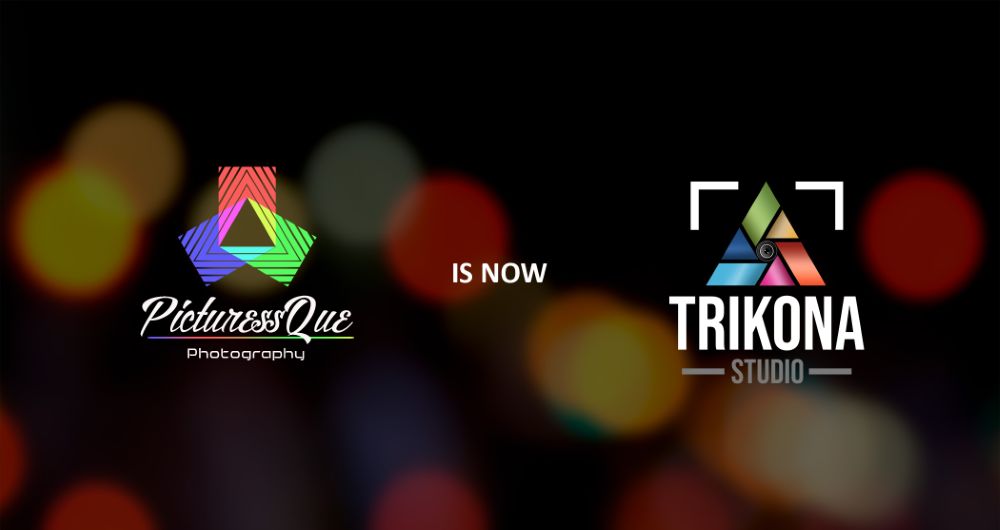
The studio needed a new identity and more visibility in its own city. It had been trading as PicturesQue Photography, and the launch artwork announced the change in one line: PicturesQue is now Trikona.
Drawing the triangle
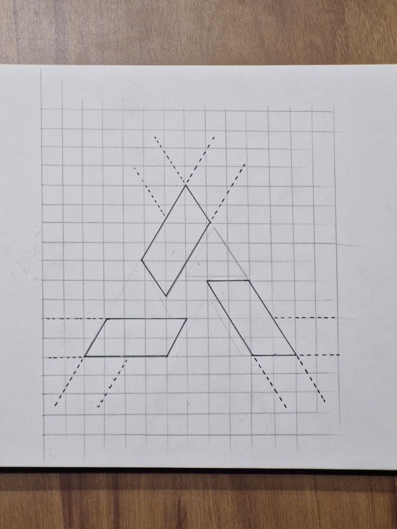
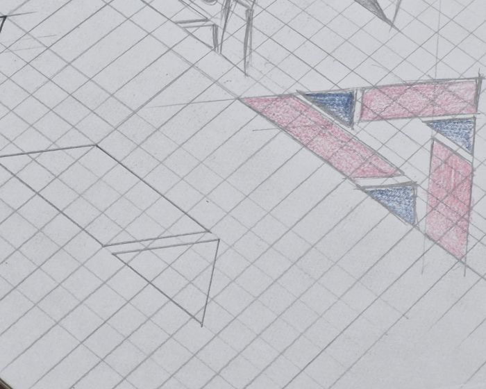
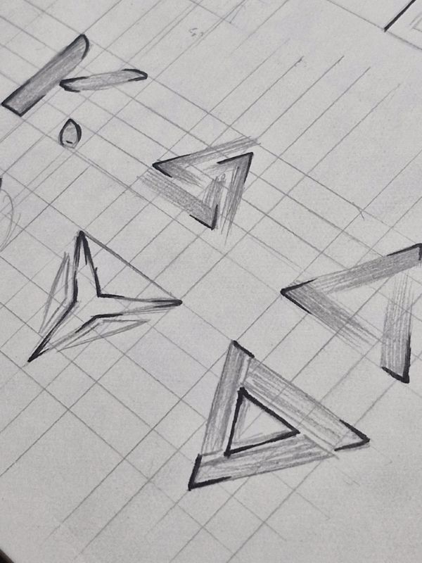
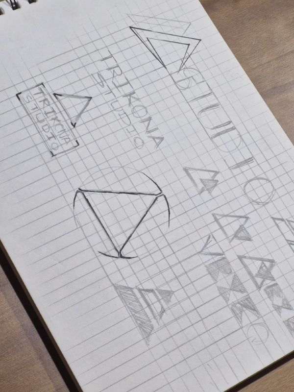
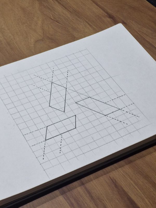
Trikona means triangle, and the sketchbook works that idea out by hand.
Parallelogram facets are plotted on squared paper with dashed construction lines. Impossible-triangle forms, three-blade rotations and a “K.” monogram are tried and set aside. A stencil-like wordmark is tested alongside, and a pass in red and blue pencil checks how the facets read in colour. Fifteen photographed pages document the process.
The mark
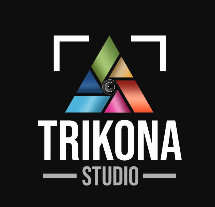
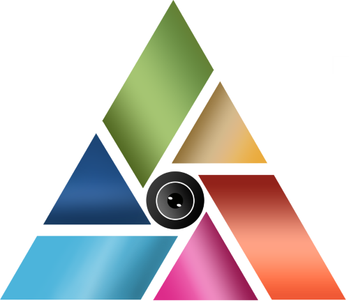
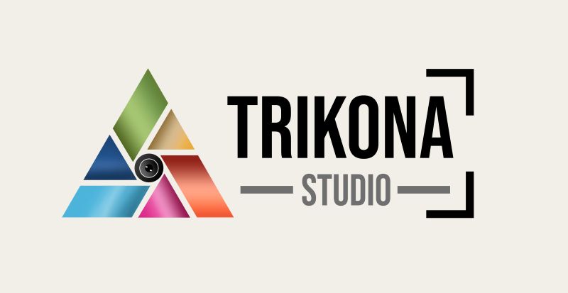
Six coloured facets lock around a camera lens, framed by the corner brackets of a viewfinder.
The facets run through green, ochre, blue, cyan, magenta and coral. A heavy condensed wordmark sits above STUDIO, set between two rules. The identity was produced in portrait and wide lockups for dark and light grounds, and as a watermark for the studio’s photographs.
From feed to front door
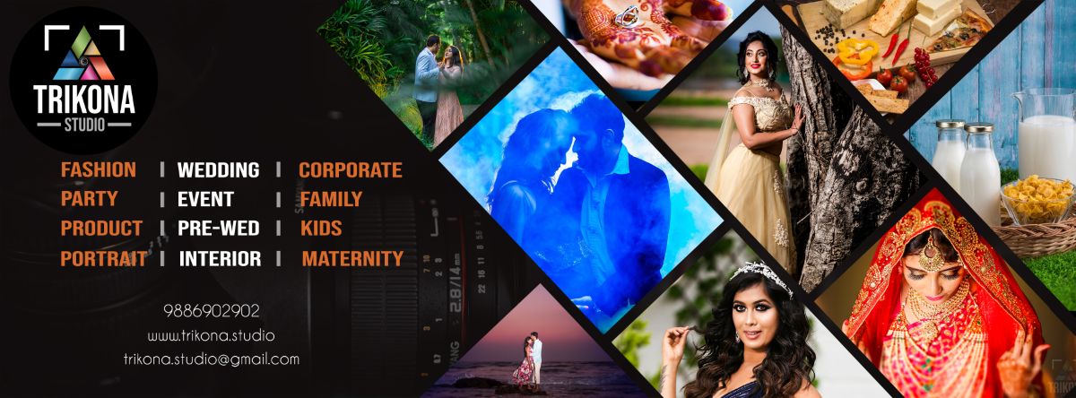
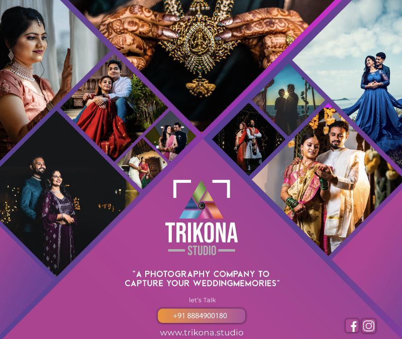
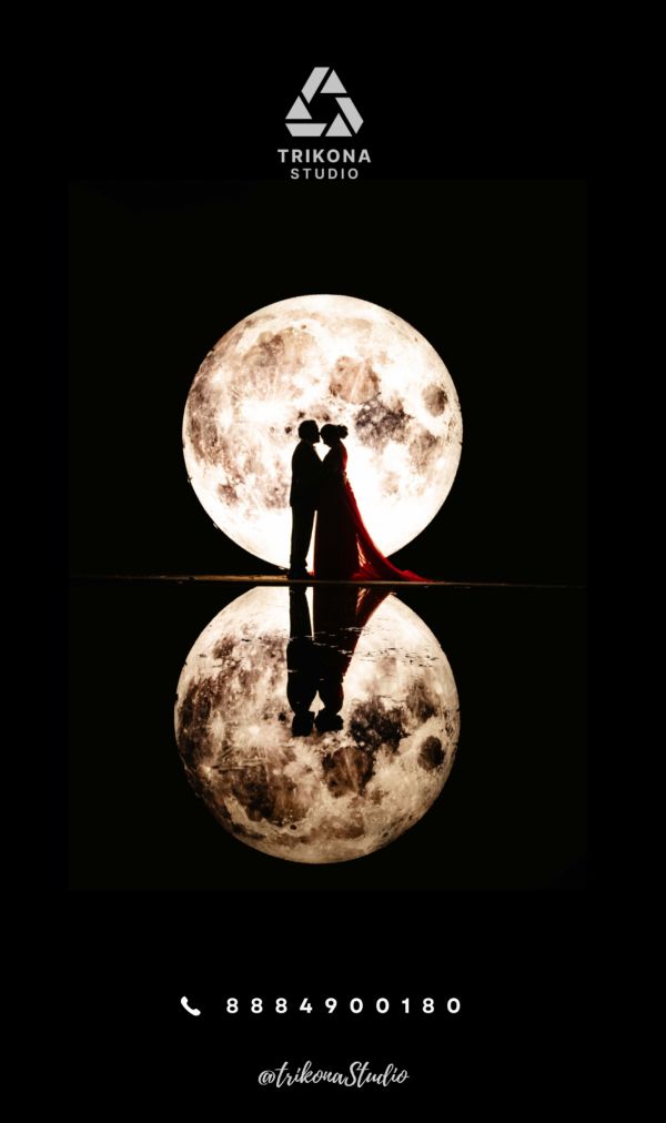
Banners and covers are built on a diamond grid that echoes the facets and fills with the studio’s own wedding photography, so its customers became the campaign.
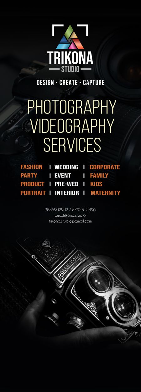
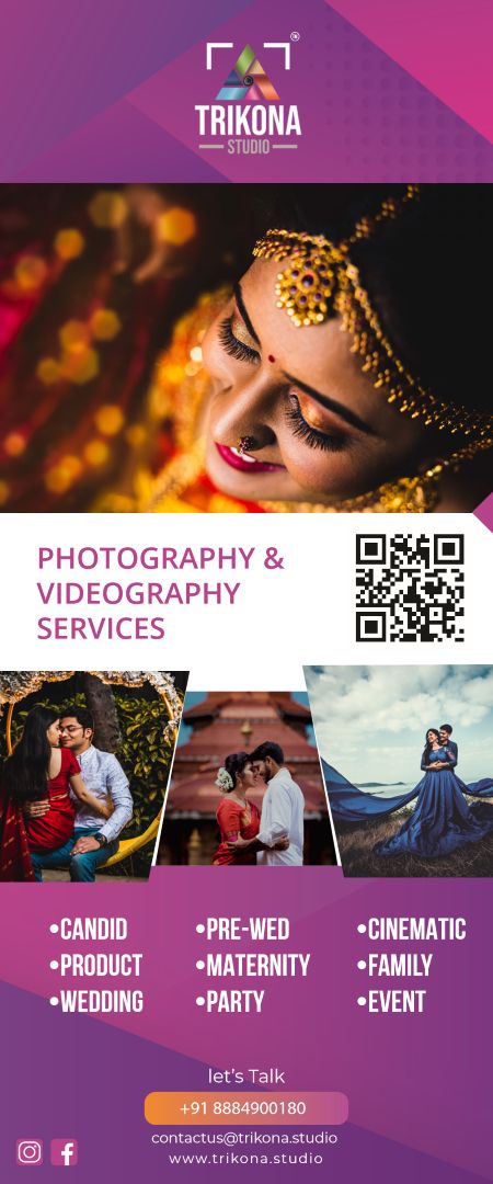
The rollout covered digital channels, print banners, a roll-up standee and large-format glass-door graphics. The doors take a quieter route: black, a vintage camera, and the list of services set in the mark’s coral.
Simplified for 2024
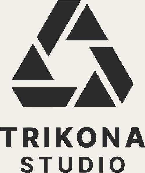
In 2024 the mark was reduced to three solid blades in a single colour.
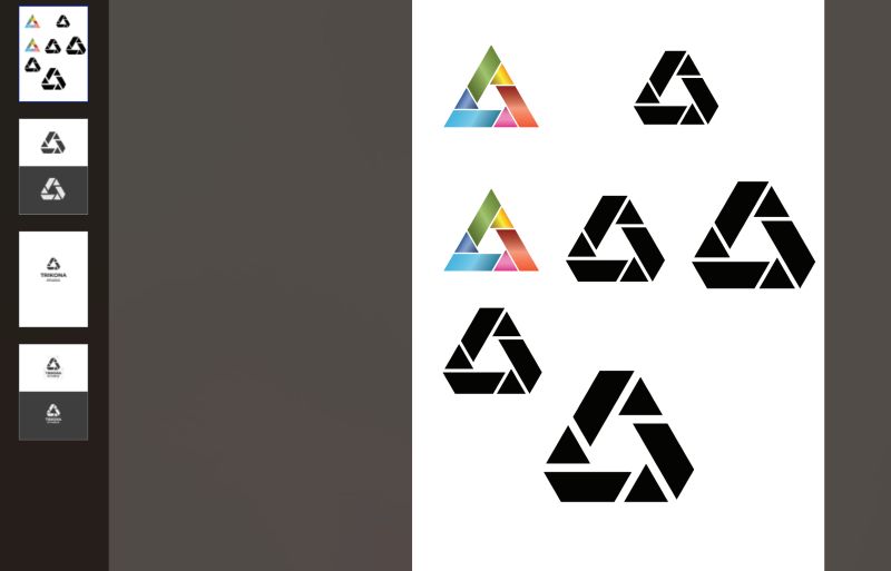
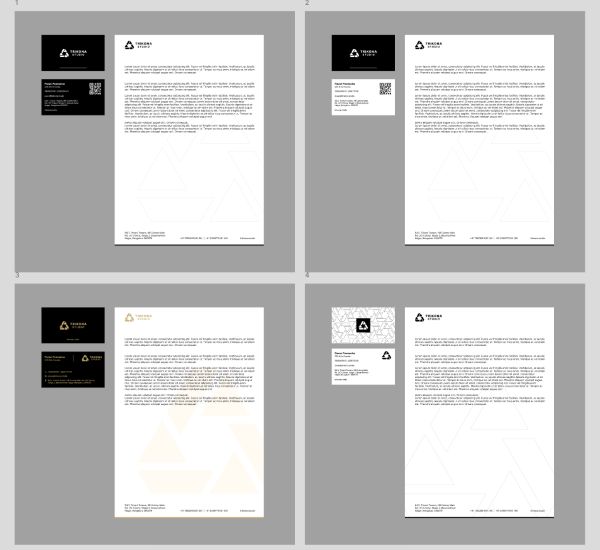
The lens, gradients and viewfinder are gone. The triangle keeps its rotation, and the wordmark moves to a wide geometric sans. The files show the reduction worked through on a board, then set as stacked and horizontal lockups in black and white and applied to business cards and letterheads.
Wedding brochure
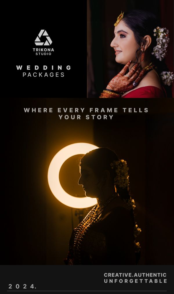
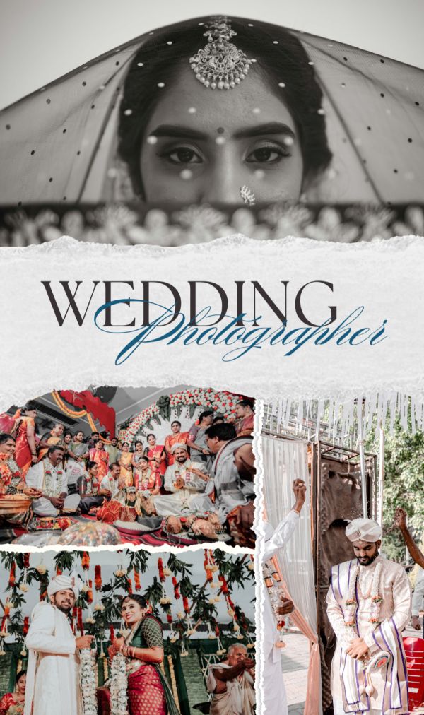
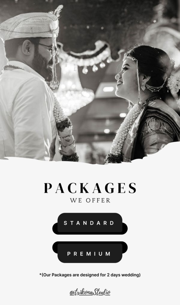
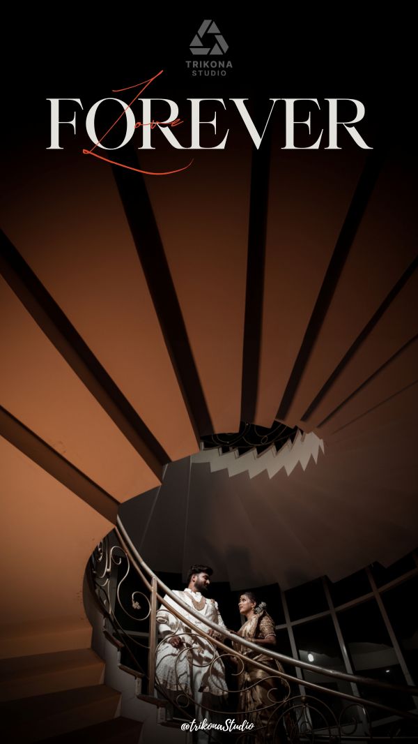
The simplified mark anchors the studio’s 2024 wedding-package brochure, laid out as tall, phone-proportioned pages.
A cover line, “Where every frame tells your story”, opens onto an editorial page that pairs a fashion serif with a script, a packages page in stacked capitals, and full-bleed image pages. Pages with pricing and client details are left out here.
Scroll →5 of 8 pages shown
Next sheet02 of 11 The Tamara